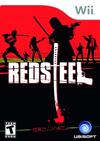
 Among the titles I purchased when I bought my Wii was Red Steel. I did this despite my own better judgement, despite the numerous negative reviews, and despite the unappealing box cover. I did it because it was the only Wii launch title available in my local store which wasn't aggressively family friendly.
I think a lot of other people are going to buy it for the same reason, and they're going to feel just as traumatised by the sheer hideousness of this game as I was.
Red Steel casts you as an American bodyguard named Scott. In a plot ripped straight from the intro to any late 80s arcade game, your girlfriend has been kidnapped and it's up to you to run and gun your way through an army of implausible enemies in order to get her back.
The game's presented as a first-person shooter. You use the Wiimote in the same way you'd used a mouse on a PC - to aim, to look around, and to shoot. My first reaction to trying out this control scheme was that you could make a pretty decent shooting game along these lines.
Red Steel is not that game.
The game feels lazy on almost every level. Other than the basic point and shoot functionality (which is fine), the rest of the controls are unintuitive and annoying. You'll be shaking the nunchuck around like an epileptic as you try to open doors, pick up guns, and change firearms on the fly. Zooming in (which you'll frequently need to do) is accomplished by making a skewering motion towards the TV with the Wiimote, which (trust me) gets old real fast.
The graphics feature some nice lighting effects but are otherwise appalling, packed with horribly pixellated textures and a legion of enemies who all look exactly the same. Key items in the environment (including ammo, enemies, and some aspects of terrain) are outlined with shades of bright white and yellow that make them look like they're the victims of bad greenscreen special effects.
The plot is painfully shallow and the majority of characters speak with exaggerated Japanese accents. Some of the plot is rendered through comic-book style hand-drawn cutscenes which could be generously described as "in the tradition of" Max Payne. However, what was an effective and deliberate stylistic choice in Max Payne here feels like Ubisoft were just too lazy to do a real cutscene.
I can't talk about how bad this game is without mentioning the menu system, which should probably be listed somewhere in a book on how NOT to design a user interface. Just getting into a game will require mousing over a variety of non-intuitive and fairly random neon-signs, reading their (often unhelpful) mouseover text, and then dragging and dropping them onto a big billboard. The best that can be said for the whole appalling menu experience is that it's consistent with the rest of the game.
The game coding isn't exactly rock solid either. Hit models for enemies are way off - sometimes you'll hit an enemy even when you're nowhere near them, while at other times nothing less than a direct shot to their head or chest will do the job.
I've played less than two hours into the game, and I'm giving up. It's going back to the game rack, and probably never coming back down. Ubisoft's nun-punching kitten-beating development antics have left a bad taste in my mouth, and really, in a world already packed with top-notch first-person shooting games, why on Earth would you waste time playing one as mediocre as Red Steel?

3 comments:
I knew 3rd party developers were concerned about the inclusion of Wii Sports and the release of Zelda being the only launch titles people went home with. So I bought RS because I wanted to support Ubi for taking a risk and releasing so many launch titles. I'd also heard that Splinter Cell's controls were terrible, so I didn't want to go that route until I'd rented it.
Within a couple of days I traded Red Steel in and picked up Rayman.
And now your life has been vastly improved as a result. Rayman's full of the awesome.
Pre-zactly!
Post a Comment